
As an analytics professional, part of what attracted me to the work of WBUR’s BizLab for the opportunity to compare analytics across a variety of sites from around the country, each with differing user-bases, use-cases and key features.
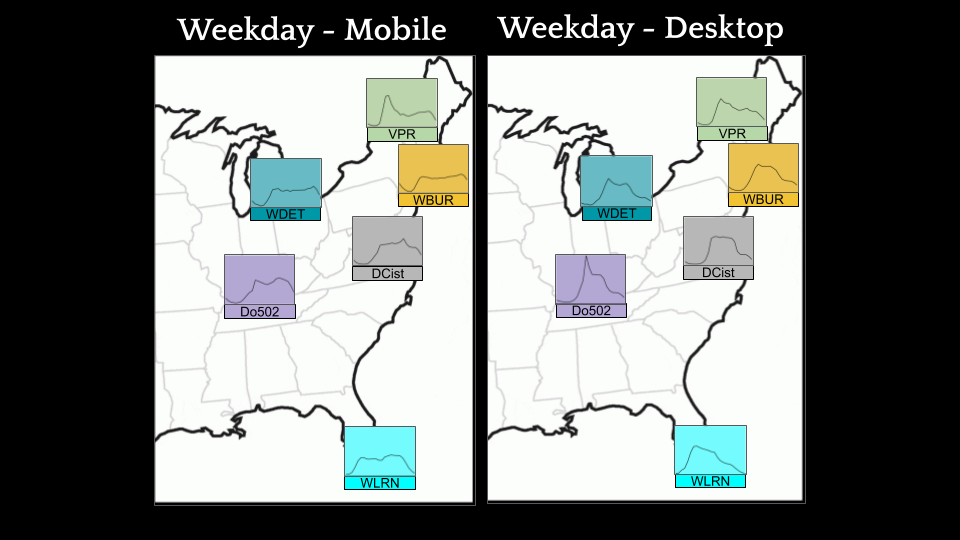
As we began research efforts with our cohort stations early this year, I reviewed each partner organization’s analytics data and immediately began to notice distinctive patterns in the time of day when users engaged with each site. BizLab cohort partners included a local event-focused site and a hip local news site, as well as the regional public radio news sites you may be most familiar with. It’s important to keep these divergent content profiles in mind when comparing traffic between sites.
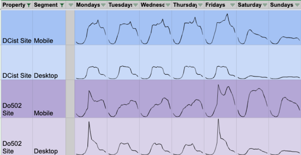
Our first two cohort partners managed sites which illustrated the distinctive traffic patterns yielded by two very different types of content. Do502 is an events site offering a guide to shows, food and activities in Louisville and DCist is a news site with an informal tone which offers stories that matter to people who live and/or work in Washington DC.
While DCist sees peaks of mobile traffic during each commute and steady desktop traffic during the workday, Do502 desktop traffic hits its peaks on Monday and Fridays when their events emails are sent out. Also, Do502 mobile activity reaches its peak on Fridays and Saturdays, while DCist mobile activity falls off on the weekends. This is when most events covered by Do502 occur, and meanwhile DCist readers know not to expect to see new content published on weekends.
With that in mind, I identified a few common time-of-day patterns in our cohort analytics data; have a look, then use the final section to compare your own data.
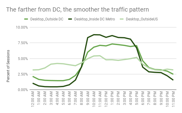
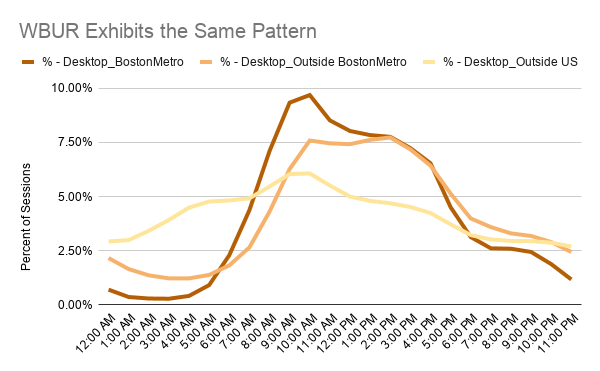
If: Your traffic sees mid-day plateaus during the work-week:
Then: You provide a steady feed of diverting content which draws your users during their workday.

- Consider this context as you make editorial decisions, or as you decide how to interpret analytics results.
- Google Analytics is not revealing communiqués from Spielbergian extraterrestrials. When your plateau is distinct as it is in the example, it’s likely that you have a localized audience.
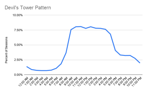
If: Your traffic features distinct peaks:
Then: Your users are largely choosing to engage with your property at the beginning and close of each day.
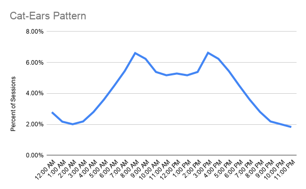
- It might be worthwhile to review sessions per user per day to understand whether for your site this pattern indicates that users are coming twice each day, or that there are two cohorts of users who respectively visit in the morning and evening.
- To understand what your users are doing during peaks, identify your peak hours and then see what sources of acquisition are strongest during peaks compared to the rest of the day.
This pattern could indicate that your site’s engagement is driven by the commute, especially if it’s especially pronounced for your mobile users.
If: Your weekday traffic exhibits a sharp morning incline, then a slow decline for the rest of the day:
Then: Your audience has good reason to check in with you first thing, but you aren’t providing as compelling a reason to return later in the day.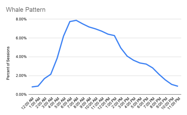
If you see this pattern in your site, consider whether it’s a strategic priority to attract more users throughout the afternoon. If so:
- Consider regularly publishing some content in the afternoon, so your users can have a reason to return after their morning session.
- If you’re sending newsletters in the mornings, check to see how much newsletter traffic is responsible for your morning peak. If its effect is negligible, consider some A/B tests around sending the newsletter in the afternoons instead.
Now you try!
-
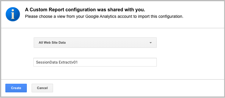
Start by adding this report: SessionData Extract|v01 to the Google Analytics instance for the property you’d like to measure.
- Set a recent date-range which results in no more than 5,000 rows of data in the report; that should give you plenty of space to extract a full year’s worth of data.
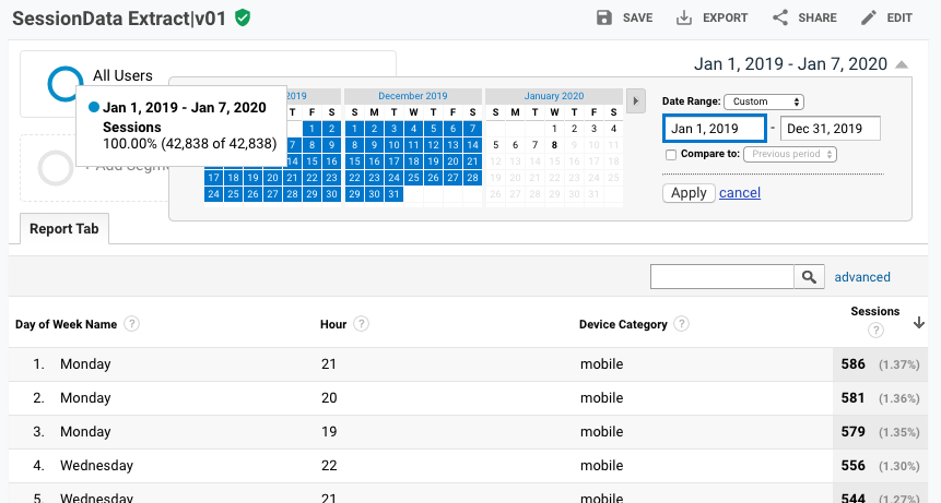
- Set the report to show the maximum 5,000 rows, then export this report to google sheets.
-
Open this template google sheet I’ve built. The template is view-only so make a copy for yourself so you can edit. TEMPLATE – Time of Day Comparison

- Now, copy the data from your exported google analytics report into the TABLE tab of your copy of the google sheet. The charts on the subsequent tabs will populate with the data you’ve added. Which of the described patterns or BizLab cohort station patterns does your traffic most closely resemble? Take a screenshot and tweet me your results at @Ted_Fuller!
Advanced: Apply custom segments to the SessionData Extract report to extract data for specific segments, i.e. regions, activities, demographics etc. Then, compare the data you’ve collected!
I’d like to thank Amira Valliani of glow.fm and Joan DiMicco of the WBUR Bizlab for inspiring this article.